Picture perfect
The importance of diagrams in communicating ideas
- Publish Date
- Authors
- Pam-Marie Guzzo
The first thing I want, whenever I’m getting started on a project, is to understand why the project exists at all. The second thing is to understand how it works and how it is supposed to work.
These are rarely the same thing.
The people building the project and the people using the project are rarely the same people. In fact, it’s not uncommon to have developers who have never once used the project as an end user, and some may have never bothered with the UI (User Interface) outside of a test suite.
So we’re often in a bit of a tricky situation. The devs don’t have the domain knowledge, time, or motivation to be completely familiar with all the workflows. The users don’t have the ability to change the workflows to what they think they should be. Instead, users send many emails and PDFs with long descriptions of the problem space, hoping to use words to convey the idea.
And they fail.
Why words are hard
Let’s start with a simple project you’re already familiar with - this very page! If you were to ask for a page that displays this post, you might write something like the following:
I want a way to easily read the thing Pam wrote about diagrams. If I really like it, I’d also like to be able to see other things Pam wrote. It might also be nice to get to other related articles.
That seems pretty clear, doesn’t it? Except wait! Where would you want to see things about me? Should the related articles be at the side? The bottom? Would you want to see a list of tags you can pick, or should the choices of which things to see be made for you? What about the list of other things Pam wrote? Should that be on this page or another page?
Why pictures are great
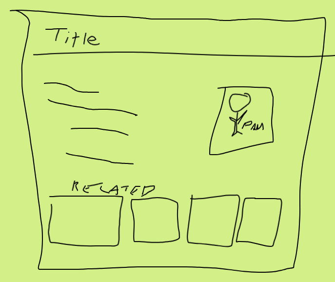
Well, that’s far too many questions! Let’s try something else. Instead of writing out what we want, let’s draw a picture.

Look at that! So many of our questions are answered instantly! We know the other stuff I wrote is probably linked through the little picture since there’s no list on the page. We know the related stuff goes on the bottom. We know there’s nowhere for a list of tags, so we can infer that the system is meant to pick the articles instead of the user.
Now this is a simple UI, and we can already see how much clarity a picture can add. Most of the time, though, we’re not talking about a blog post view. Instead, we’re talking about complex systems, with multiple users, lots of data, and probably interactions with other systems.
Systems diagrams
I’m not going to get too deep into the rabbit hole of diagrammatic reasoning (feel free to lose many hours to wiki if you’re curious). There are a boatload of different ways to diagram systems, workflows, user experiences, and everything else you can think of. Instead, I generally try to aim for simple diagrams that convey the intended workflow and side effects (like saving their data) for a specific user.
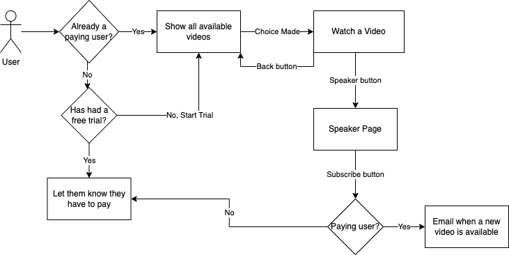
Like I said in the beginning, my first concern is always the why, and the why always starts with the end user. So let’s try this again, describing a relatively simple workflow with words and then drawing out the diagram. For shameless plug reasons, we’ll pretend we want to build a subscription streaming service that serves up ad-free videos from the Test Double YouTube Channel. The person asking for this to be built might say something like this:
I want a user to be able to login and see a place where they can pick a video to watch. They should also be able to subscribe to videos made by a certain speaker. If someone isn’t logged in, they should go to a free trial page that also has a subscribe option, but only the subscribe option should be there if they already had a free trial.
That’s pretty simple but already a bit confusing. The word subscribe is used a lot with different intentions, there’s some vagueness around what happens with free trials, and there’s the issue we ran into before about where a user would see more content by the same speaker.

Now, you might be thinking, “couldn’t you just have used more words to describe that entire flow?” Maybe! Except there were parts of the flow I didn’t think of until I made the diagram. Until I went to draw it out, I didn’t really think of what “subscribing” meant, and I really didn’t think of what would happen if someone with a free trial tried to subscribe. Creating a diagram doesn’t just add clarity for the person doing the building – it’s also an invaluable tool for the person asking for the system.
A picture is worth a thousand words
Now that I have so convincingly argued for pictures and diagrams, you might be wondering where to use them. I personally like to have shared documentation between the business and developers for workflow diagrams. It’s also usually a good idea for the team to have some internal diagrams, especially of system interactions and data structures. These will likely change a lot, so make sure they’re saved in a format that is easy to edit.
You should also accept that the first pass at a diagram for a system will be wrong. System interactions can be extremely complicated, and you’re likely to need a few iterations before you can clearly show all the interactions in a way that makes sense for everyone. The additional clarity is worth the effort.
Pam-Marie Guzzo
- Status
- Double Agent
- Code Name
- Agent 00109
- Location
- Ottawa, ON
